BRANDING
A more in-depth logo at some of the branding projects I’ve worked on.
CNI
CNI is a Dayton, Ohio area telecom service company, specializing in supporting local, small businesses. They were looking to merge a few of their companies into a new, unified brand.
Ultimately, their logo didn’t stray terribly far from their old branding, but has a much simpler and more modern look.


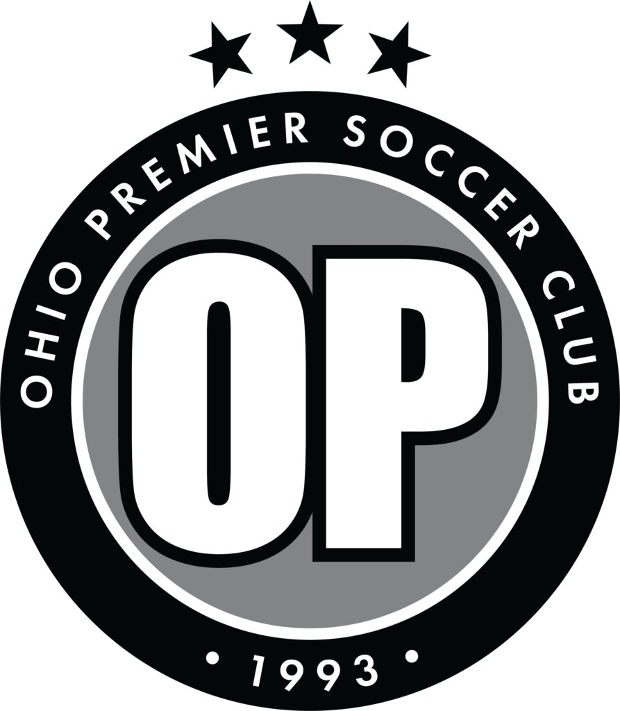
OP Soccer
Ohio Premier Soccer Club is a Central Ohio competitive soccer club for kids aged 4-23. They were looking for a simple refresh to their logo and overall branding that could be carried across all of their communications.
While we proposed some more dynamic options initially, they wanted to maintain the “OP” they initially had to stay recognizable.


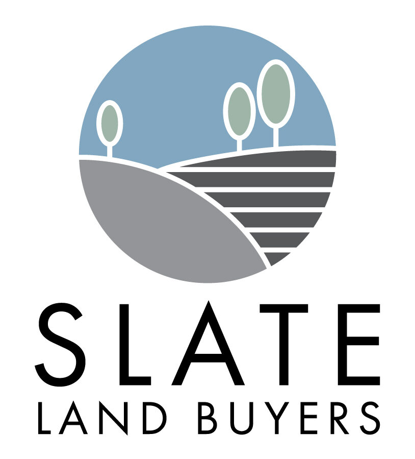
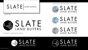
Slate Land Buyers
Slate Land Buyers is a group that is focusing on purchasing, developing, and selling land in North Carolina .
They came in with an existing parent company, and wanted to keep some of their original branding (namely the font treatment), but still develop a unique identity. What we ended up with is professional, but approachable, and helps them stand out.


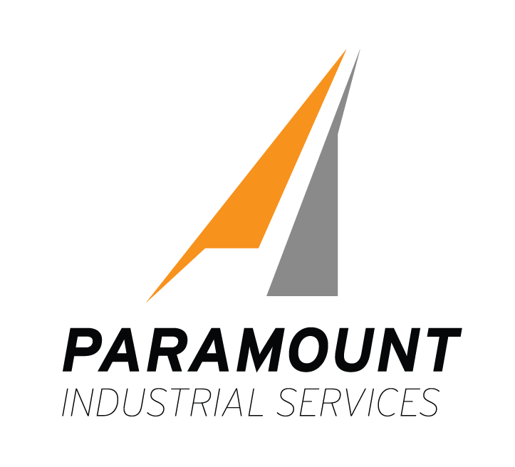
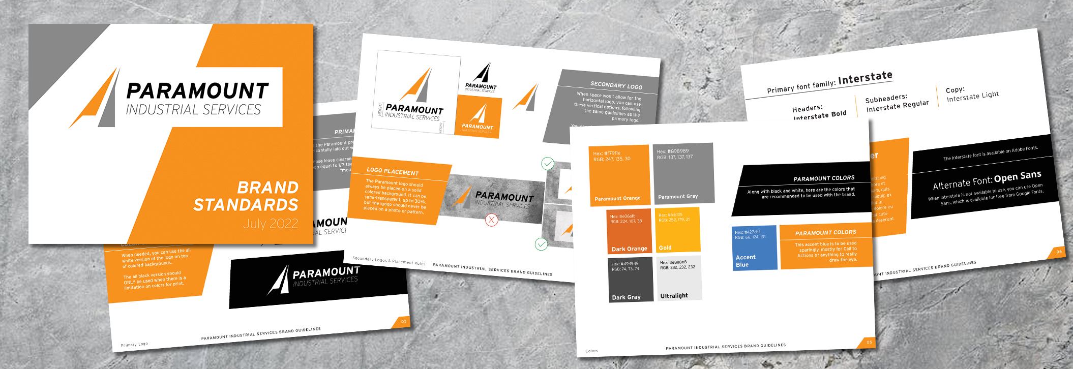
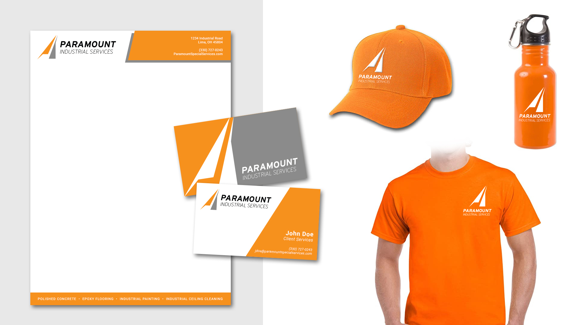
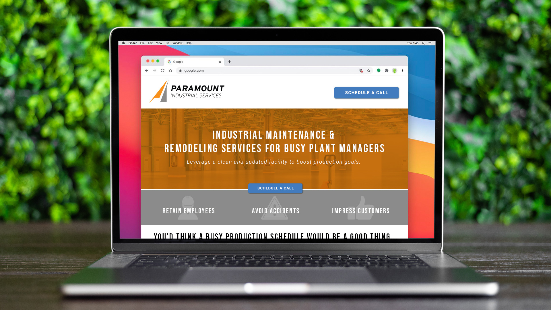
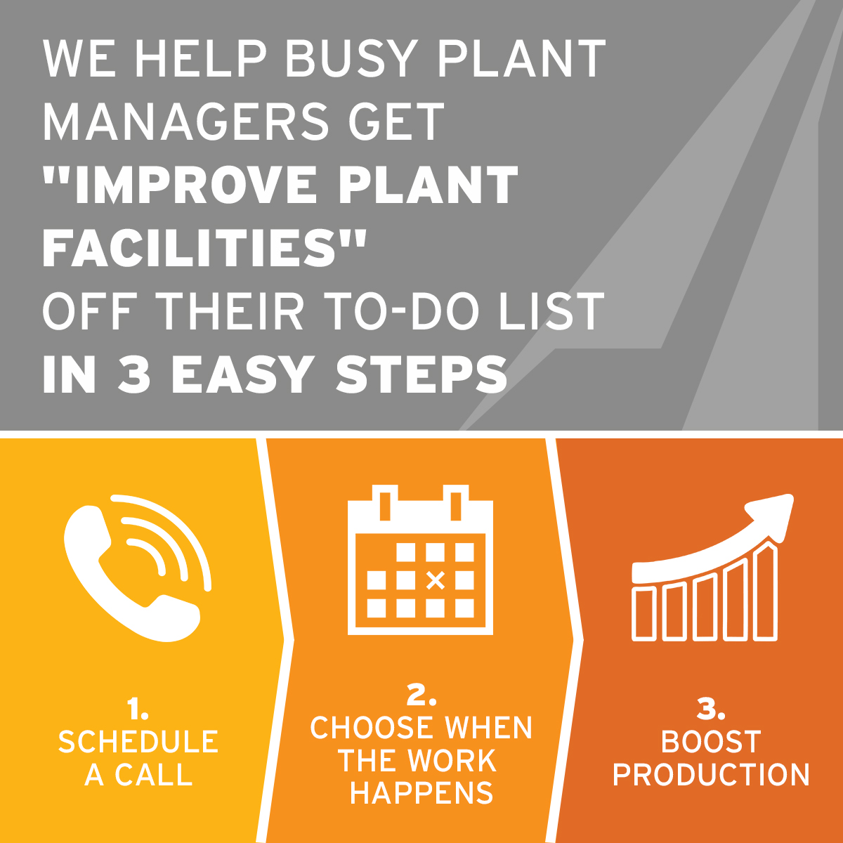
Paramount Industrial Services
Paramount Industrial Services serves many states across the Mid-West and East coast with maintaining their warehouses and facilities. Cleaning, painting, and restoration, they do what it takes to keep your business operating without the headache of taking care of maintenance on your own.
Though we tried several iterations of their logo with a mountain or a capital “P”, ultimately we ended up with something a bit more abstract, implying the mountain or at least the trajectory upwards, towards the top.